
Focus 01
Analytics dashboard
Clear, data-driven visibility into dating behavior and patterns.
Trade-off. Too metric-heavy. More numbers increase cognitive load and anxiety while offering little emotional clarity.
I redesigned Bumble's Insights into a behavioral health dashboard that helps daters understand their own patterns instead of swiping through them. A self-initiated concept across mobile, web, and watch.
Bumble's Insights feature offers profile tips: advice about your photos, nothing about your behavior. Over four weeks I redesigned it into a dashboard that turns behavioral data into reflection, gentle nudges, and healthier engagement.
The problem
Fatigue loop
Users swipe, match, and burn out, with no feedback on why, or what to do differently.
The solution
Behavioral insights
A personal dating health dashboard: patterns made visible, paired with supportive next actions.
What I delivered
Cross-platform concept
End-to-end flows for mobile, web, and Apple Watch, plus a scoped design foundation.
Why it matters
78%
Of users report dating-app exhaustion. That is the retention risk today's Insights ignores.
Bumble's existing Insights only offers surface-level, profile-based advice: photo tips, bio suggestions. Well-intentioned, but it does nothing for users caught in the swipe → match → drop-off loop, chatting and deciding until they're emotionally drained.
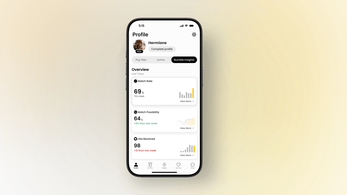
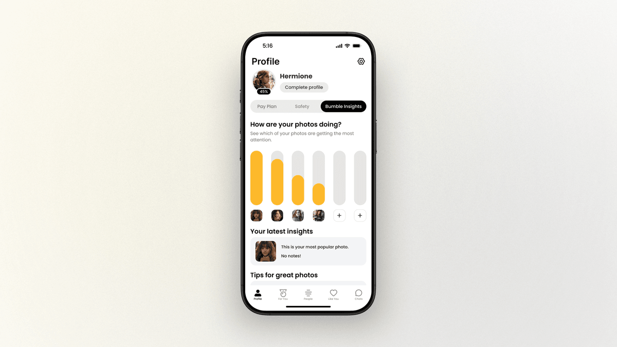
Today's Insights: Existing Bumble Insights — 'How are your photos doing?' with photo performance bars. Profile tips only, no behavioral data.. Redesigned: Redesigned Bumble Insights — Overview dashboard with Match Rate 69%, Match Possibility 64%, Like Received 98. Behavioral data visible..
For the user
Activity without awareness. The loop repeats, burnout builds, and nothing explains why it feels this way.
For the business
Fewer returns · Fewer matches · Fewer upgrades
A fatigued user is a churned user.
Design challenge
How might we redesign Bumble Insights to provide actionable, emotionally intelligent feedback that reduces dating app burnout and supports healthier dating habits?
I grounded the concept in a Forbes Health study of dating-app fatigue, then ran 6 in-depth interviews with current dating app users to understand what the numbers feel like from inside the loop.
User interview
“Swiping feels like scrolling TikTok — addictive, but empty.”
User interview
“Sometimes it goes well… I have a great conversation but I don't know why. I wish I could see what worked that time.”
User interview
“I've been swiping a lot lately… but it's starting to feel like a habit, not a choice.”
Every interview converged on the same pattern: users could describe the fatigue vividly, but none could explain what was causing it. The app gives them activity without awareness.
Most dating apps optimize for more sessions and more swipes. The research pointed somewhere else: the gap sits between activity and self-awareness.
Old question
How do we get users to engage with the app more?
Real question
How do we help users understand their own dating behavior, and act on it?
Key insight. Users don't need more data or more restrictions. They need a loop of insight → reflection → reset, so engagement becomes a choice instead of a habit.
Starting from hand-drawn sketches, I explored how behavioral feedback could show up: raw analytics, screen-time limits, or contextual guidance. I tested each against one question: does this reduce fatigue, or add to it?
Focus 01
Clear, data-driven visibility into dating behavior and patterns.
Trade-off. Too metric-heavy. More numbers increase cognitive load and anxiety while offering little emotional clarity.
Focus 02
Healthier pacing through screen-time limits and recommended breaks.
Trade-off. High risk of pushing users away from the app entirely: restriction without understanding.
Direction 03
SelectedSupportive, contextual feedback that improves awareness and pairs every pattern with an actionable next step. Needs careful tone and rule design to avoid nudge fatigue.
The strongest path was a hybrid: the clarity of the dashboard, the wellbeing support of boundaries, and the personalized guidance of behavioral insights. Behavior signals users can understand and act on, rather than more data or more restrictions.
The final direction brings together data clarity, emotional support, and gentle guidance. Each feature answers one moment where users currently get stuck.
Problem. Raw match and swipe stats are numbers without meaning. Users can't tell what's working.
Solution. Interactive cards turn the numbers into simple, animated visuals paired with quick AI-generated highlights, so patterns become explanations.
Problem. Even when users see a pattern, like a peak match time or a strong week, they don't know what to do with it.
Solution. Highlights pair each pattern with one concrete next action: set a reminder for peak times, revisit skipped profiles, reach out to a match.
Problem. The only nudge the app knows is 'swipe more', which deepens the loop.
Solution. Light pop-ups redirect energy toward actions that matter: message a new match, check weekly insights, take a short break. Kept minimal so each one stays worth reading.
Problem. Data alone can't hold someone through burnout.
Solution. Bite-sized tips and reflections blend data with human advice: slow down, set intentions, notice what's working.
Design focus
Engagement through intention, not suppression. The dashboard never tells users to leave. It helps them come back on purpose.
Because the feature delivers emotionally sensitive feedback, I scoped a design foundation on top of Bumble's existing visual language, with typography, spacing, and color tuned for calm interpretation, then adapted it across every surface where reflection happens.
Type, color, spacing, elevation, motion, and dark mode, organized as a reusable Figma library and applied consistently across the final designs.
Extended views with rich data visualization, for users who want to explore their behavioral trends in depth.
Product thinking
Dating fatigue reframed through business and feasibility lenses until it could be prioritized like any other product problem.
Individual contribution
Literature review through system foundations, with no one else in the room to defer to.
Forward looking
Architected for mobile, web, and wearables from day one, so the concept could grow beyond a single screen.