
Focus 01
Hero section
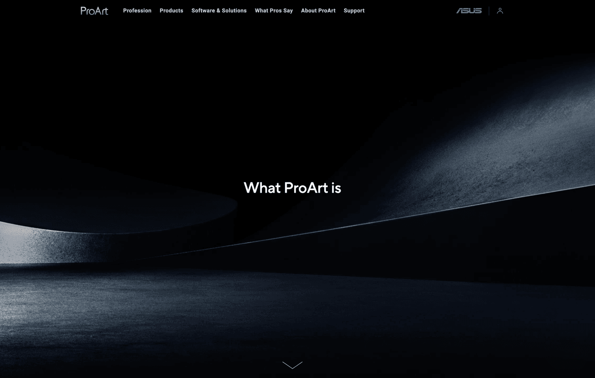
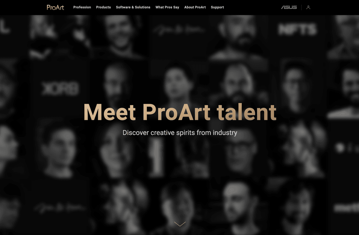
Story-led hero with creator proof and partner logos. The first impression that frames evaluation.
I owned the information architecture, navigation, responsive experience, and accessibility for ASUS ProArt's global platform, rebuilding it around how creators evaluate tools. Foundation work came first, then a creator-validation hub and a reusable design system.
ProArt WebsiteThe bet: the site didn't need better visuals, it needed a decision layer built in. I led that rebuild so creators could move from curiosity to a confident choice: decision-led product pages, a creator hub the old architecture couldn't support, and a component library marketing reused for later campaigns.
CTA click-through
+25%
Primary calls to action drew more clicks once the decision structure guided people into product and discovery paths.
New page type
What Pros Say
I designed and tested a creator-validation hub that only became possible after the foundation was in place.
How it scales
Reusable DS
Campaign pages ship from shared components instead of one-off rebuilds.
ProArt is the flagship creator line at ASUS, a company generating NT$500B+ in annual revenue across 70+ countries. It serves filmmakers, designers, and animators who expect precision in the tools they choose. The hardware earned that trust, but the site was organized around products, while creators arrived with a decision to make.
Research and stakeholder interviews revealed a consistent pattern: professional creators came to the site with evaluation questions, not browsing ones. The information existed in pieces. The structure to connect it didn't.
Decision gap
The site contained the information users needed. It just wasn't organized around the decisions they were trying to make.
Research confirmed the issue wasn't visual. The site had no layer for guiding evaluation decisions, and every local fix would break again without a shared foundation.
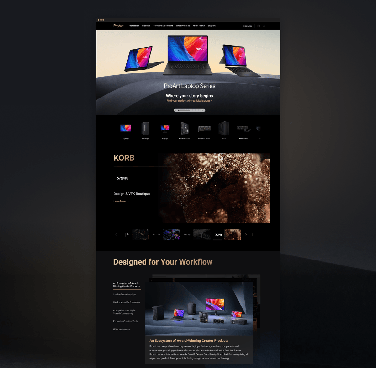
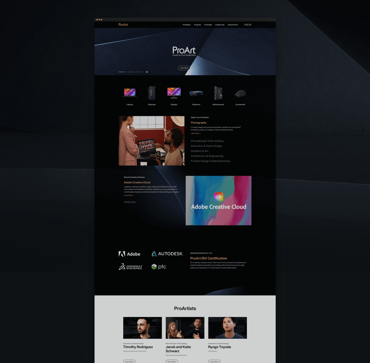
Before: Original ProArt site: product-led navigation with no evaluation path.. After: Redesigned ProArt site: story-led creator hub with decision-oriented structure..
Design bet
The only durable fix was to build the decision layer in, not paint over the gap with better visuals.
Before designing screens, I worked with PM and engineering to map every gap against an impact × effort matrix, co-owning the call to sequence the foundation before expansion. Phase 1 had to hold Phase 2, not become a surface we'd rebuild in six months.
I traded off marketing flexibility against user clarity, and designed brand and engineering constraints in from the start with PM, brand, marketing, engineering, and QA, instead of negotiating them after handoff.
As creator partnerships grew, peer validation became essential. Creators trust other creators who already made the decision they're facing. The old architecture had no room for that story.
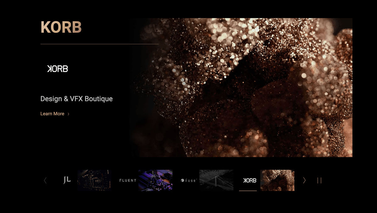
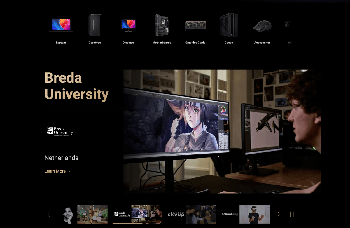
I designed "What Pros Say" as a dedicated storytelling hub where artists speak directly to people evaluating the same tools. This page only became possible because Phase 1 gave us a modular system that could hold a new page type.
Focus 01
Story-led hero with creator proof and partner logos. The first impression that frames evaluation.
Focus 02
Modular carousel explorations for partner and creator stories. Twelve layout patterns before narrowing.
I reviewed three directions with cross-functional partners. Layout C won because it held varied creator stories without clutter, performed on lower-end devices, and extended as partnerships grew. In an internal review, 7 of 12 stakeholders preferred it, which we treated as directional support for the final approach.
Insights from review
Stakeholders
Marketing, brand, and engineering needed a layout that could hold varied creator stories without bespoke rebuilds for each partnership.
Stakeholder read
The carousel is interactive and includes detailed information, which works well to engage users.
Performance
Layout C performed smoothly across lower-end devices and was built for modular CMS extension as new partnerships came in.
01
I adopted a Z-pattern across product pages. Capability leads, creator validation builds in the middle, product action comes last.
02
I aligned typography, palettes, and contrast rules with ProArt's identity, fixing failures that blocked use in varied professional environments.
03
I defined a responsive grid and component rules so the evaluation path holds on desktop, tablet, and mobile.
The three fixes above shipped as reusable rules, not one-off pages. I delivered core styles, reusable components, and engineering-ready specs so future pages scale without recreating the same decision problems.
Typography, color palettes, and a responsive grid. The rules every future page starts from.
Key pages rebuilt with consistent hierarchy, accessible color, and the shared component library. One coherent system across desktop, tablet, and mobile.
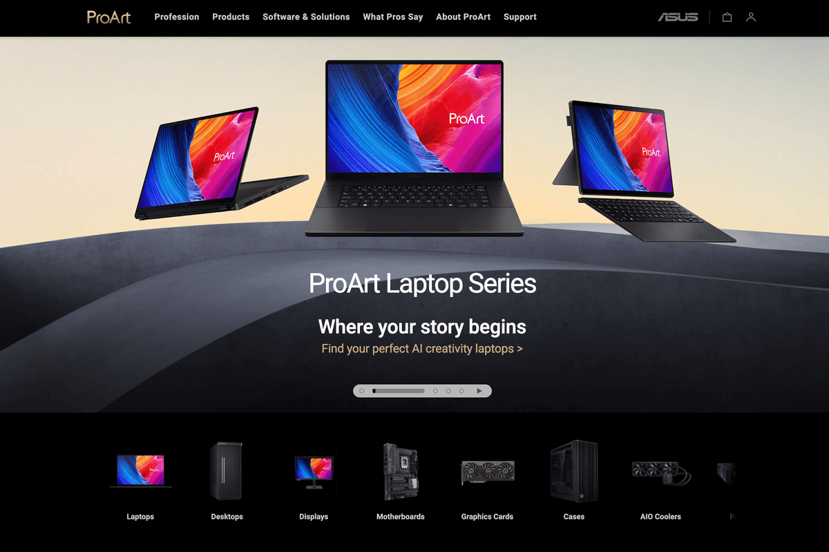

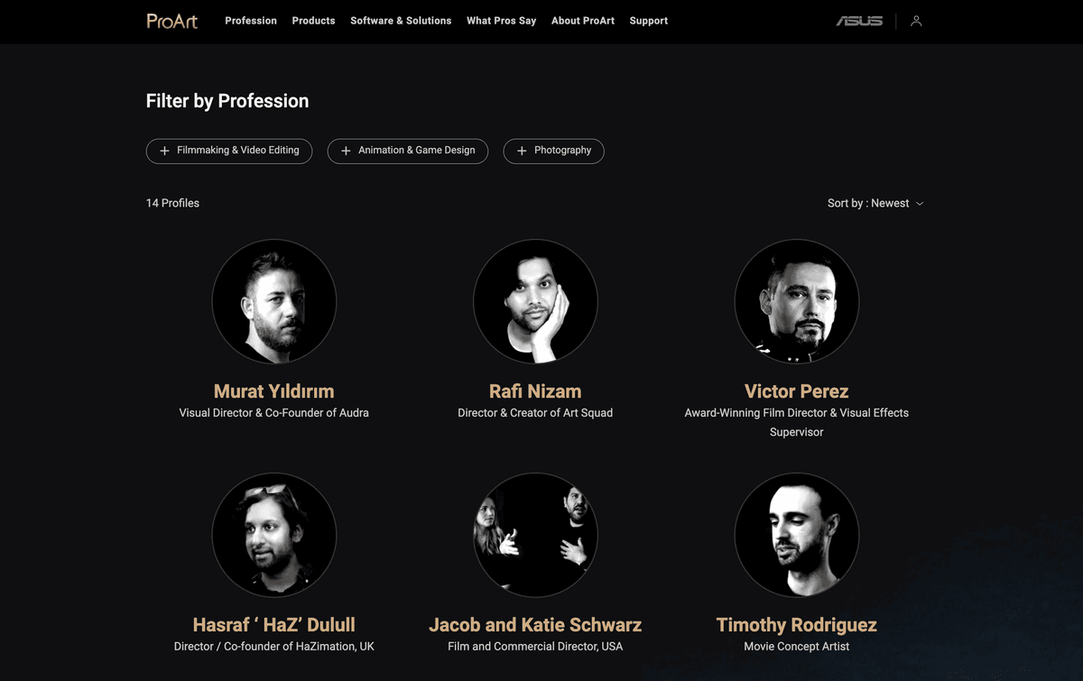
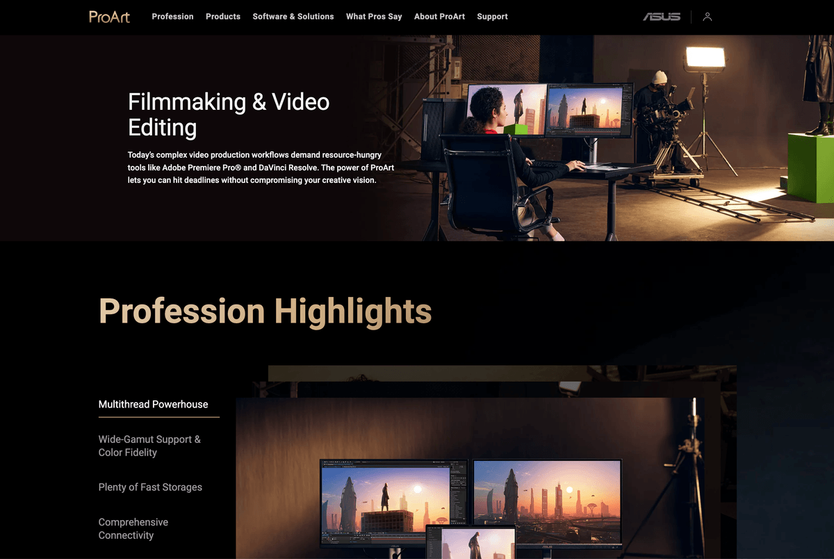
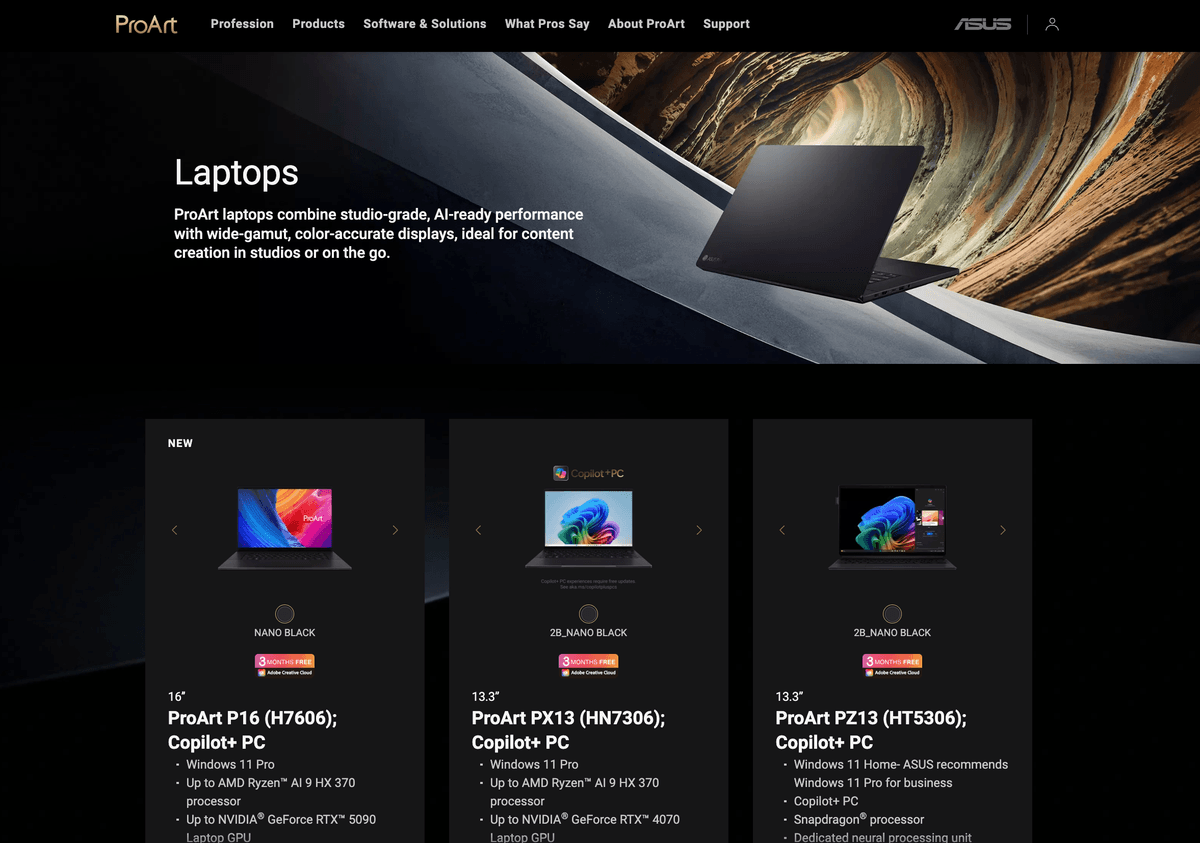
Two outcomes from the shipped system: one from product analytics, one from a WCAG-based accessibility audit.
/ 01
Primary CTA click-through
/ 02
Accessibility issues resolved
Looking back, the problem was never missing information. It was missing structure. Since this project I sequence foundation work before expansion pages, and I start from the decision people are trying to make rather than the interface.